![]()
In this case study, I’d like to talk about the application Snapchat from the perspective of a user experience designer. At first, I thought that this application was meant more for teenagers and the younger generation. I gave it a try, created my account and have been using it for about a year and half now. I understand the appeal and I’ll talk about it here.
How it works
Snapchat is strictly mobile application. It operates on both iOS and Android phones. The slogan of Snapchat is to, “Live in the moment!” This is exemplified by the core mechanics. A picture or video (called a snap), is taken on the user’s phone and can be sent to another user. This picture can be only viewed once and it expires after the receiver has viewed it. The sender is able to set the duration of how long the picture will be from 1 to 10 seconds long. Typically, the sender would set the duration to be longer in order for the receiver to be able to understand the information being sent. An example would be a sign with text where the receiver would need the extra time to read. Another example would be for the receiver to be able to take a screenshot of the photo. Keep in mind that if the receiver takes a screenshot of the photo, the sender is notified through the app.
I know you’re there…
The screenshot notification isn’t the only example of how the sender is notified. The sender is also able to see whether or not the receiver has opened their message. This is similar to Apple’s ‘Read receipts’ in their iMessage application. This is useful for the sender to see if their recipient got the message but can be awkward if no reply was given when expected. Going back to the screenshots, it is also useful for the sender to know if the recipient took a screenshot. One of the popular trends with this app is to use it for sending inappropriate photos (ex. nude pics) back and forth. It would be useful for the sender to see whether or not the recipient did indeed take a screenshot to forever keep the photo but this of course may end up in deep trouble!
Story
Users also have the option to post their snaps to their “Story.” The Story in snapchat serves as a slideshow for all of the user’s snaps of the day. Each snap posted to a story lasts for 24 hours. After that time period, it expires like a regular snap. A reason why a user would want to post something on their story is so that all of their friends can see what they were doing in their day. If it’s something more private or directed to a certain person, then they most likely would send a snapchat to a specific user than posting it for all to see.
Friends of the user can view the user’s stories as many times as they want to within that time period
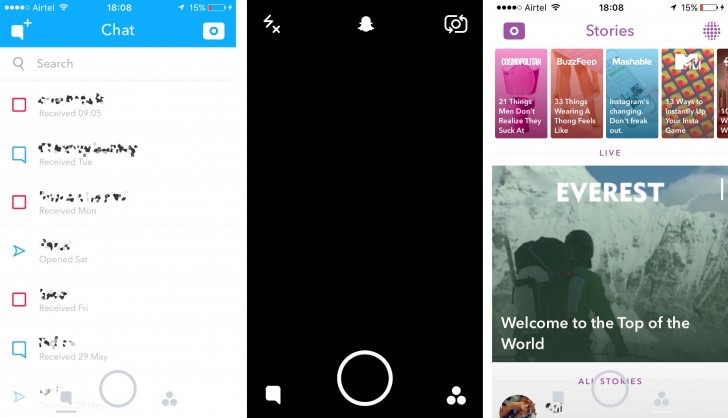
User Interface

The initial screen is very simple to use. It opens up the camera with an overlay of the UI controls. The biggest button on the bottom is to capture photos with a single tap or videos by pressing and holding. Tapping on the bottom left icon (or swiping to the right) will take the user to their snapchat inbox. Tapping on the bottom right (or swiping to the left) takes the user to the the stories area. The top left icon toggles flash. The top icon opens up the profile and options and finally the top right button toggles between the main and front-facing camera. Nothing is too obtrusive and everything is neatly laid out.
Geofilters
This feature takes advantage of the user’s location and provides filters for that specific area. This makes it interesting for when users are in a particular city and want to share it with their friend. The geofilters for cities are a created by users and some areas have multiple filters for the same area. It’s fun to go somewhere new or out of town and see what geofilter is available.
Users can also pay for geofilters for a specific day, location and time. This is useful particularly for promotional events. I saw this feature utilized by my friend’s wedding where they asked someone to design the geofilter and submit it to Snapchat. The charge is dependent on the radius of the location, and the day/time the filter will be available. It was really cool especially since everyone was using their phones and made the event feel more exclusive.
Lenses

This is a newer feature that Snapchat added which has gained A LOT of popularity. When using the front-facing camera, the user can press and hold on their face and the application utilizes face detection technology. From here, different filters can be selected which would alter the user’s appearance. It’s augmented reality! This adds another way for users to convey emotion and really to just have fun. Snapchat makes this feature interesting and exciting by changing the available lenses daily.
Live stories and advertisements
In addition to regular Stories, users can also add to “Live Stories.” These stories are based on the user’s location and/or a current event. For example, there is an option to add to Seattle’s Live Story. The user can take a snap and submit it to the Live Story where all users in that area whether friends or not can view them. A great example of Live Stories was for finals week. I was able to watch students all across the country freak out over their final exams and see their joy completing their last assignment for the year.
Publishers have also taken their place on Snapchat. Some of these include the Wall Street Journal, Mashable, and Cosmopolitan. There’s a great variety of outlets and it’s a great way to stay up to date with current news. Each publication on snapchat has a headline (up to 10 seconds) and the users can swipe up to read the full story or skip to the next headline. There are ads put in between so this, along with having publishers on the app generate great revenue for Snapchat. It only helps their profits with the expanding number of users.
Update
I’ve heard mixed thoughts regarding the most recent update of Snapchat. Personally, I like it. It looks much better in my opinion and the icons have been refreshed to look more rounded which is pleasing to my eye. They completely changed the hamburger menu which appeared on the bottom right to a triangular collection of dots. I’m mixed in this change but I assume that they intended for this to go with the more rounded look and feel. There is also a parallax effect utilized with the UI. This is a new subtle feature but it’s very nice. Previously, moving left and right to the different pages felt separated and disconnected but now it feels fluid, cohesive, and part of one whole page.
Finally, the stories page got a refresh. It went from simple dots to large rounded rectangular photos which highlight the headlines from each publisher. I have a feeling that Snapchat wanted to accommodate the publishers better by making their stories stand out more. There is also a subscribe button now which allows the users to see the publishers and stories that are the most relevant and interesting to them.
Conclusion
What separates Snapchat from Facebook and Instagram is the idea that everything is live and in the moment. Other forms of social media contain posts from an earlier time where it’s all planned out. Snapchat goes against that by allowing the users to document what they’re doing right at that moment in time. It opens up quickly, easy to use and really emphasizes the feeling of fun with all of it’s features. I’m sure Snapchat will continue to grow especially now that they have such a great amount of users. Many celebrities use Snapchat too which let the users see their favorite people in a more personal setting–to see them in their actual lives. Ads will also reach a great amount of users and this means big money for companies and for Snapchat as well. With all of these new features being added, it makes me wonder, how much more until it feels like too much? Snapchat has cleverly added new features to improve the experience while still being accepted to it’s users. It will be interesting to see how much Snapchat will change in the next five years and if their changes would be so radical that it would deter their ever expanding user base.
